vertical percentage margins
some experiments and backgrounds
In his article Vertical Percentages in CSS (November 14th, 2013) Louis Lazaris writes:
- "A percentage value on top/bottom padding or margins is relative to the width of the containing block."
My attention to this article was drawn by the topic "This Week in CSS - November 25 2013" in the SitePoint forums.
1. The tests
test 1
On the right is a green bordered #containingBlock with a width of 200px and a height of 100px.
Inside is an #inside container with a {margin-top: 10%}.
Now 10% of the height is: 10px. And 10% of the width is: 20px.
For the margin-top the real computed value in this browser *) is: .
!
*) "this browser" = your actual browser while visiting this page.
test 2
On the right is a green bordered #containingBlock with a width of 200px and a height of 150px.
Inside is an #inside container with a {margin-top: 10%}.
Now 10% of the height is: 15px. And 10% of the width is still: 20px.
For the margin-top the real computed value in this browser is: .
!
test 3
On the right is a green bordered #containingBlock with a width of 400px and a height of 100px.
Inside is an #inside container with a {margin-top: 10%}.
Now 10% of the height is: 10px. And 10% of the width is: 40px.
For the margin-top the real computed value in this browser is: .
!
test 4
On the right is a green bordered #containingBlock with a width of 200px, and a height of 100px.
Inside is an #inside container with a {margin-top: 10%} and a {margin-left: 10%}.
Now 10% of the height is: 10px. And 10% of the width is: 20px.
For the margin-top the real computed value in this browser is: .
!
For the margin-left the real computed value in this browser is: .
As expected: !
test 5
On the right is a green bordered #containingBlock with a width of 80px, a height of 100px, a padding-left
of 20px and a padding-right of 100px.
Inside is an #inside container with a {margin-top: 10%} and {margin-right: -100px}.
Now 10% of the height is: 10px. And 10% of the width is: 8px.
For the margin-top the real computed value in this browser is: .
!
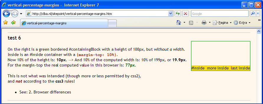
test 6
On the right is a green bordered #containingBlock with a height of 100px, but without a width.
Inside is an #inside container with a {margin-top: 10%}.
Now 10% of the height is: 10px.
And 10% of the computed width is: 10% of , or .
For the margin-top the real computed value in this browser is: .
This is according to the css3 rules!
- See: 2. Browser differences
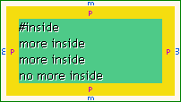
test 7
more inside
more inside
no more inside
On the right is a green bordered #containingBlock with a width of 200px, but without a height.
Inside is an #inside container with a {margin: 3%} around.
The #inside container has also a {padding: 7%} around.
The 3% of the width is: 6px.
For all margins the real computed value in this browser is: .
!
The 7% of the width is: 14px.
For all vertical paddings the real computed value in this browser is: , like for
the horizontal paddings.
!
2. Browser differences
Firefox 23/25: everything well done.
Chrome 31: everything well done.
Opera 17/18: everything well done.
Safari-Win (5.1.7): everything well done;
with a difference in the rounding of the computed values: floating point numbers are rounded downwards (e.g. 19.9px → 19px),
while all other browsers are rounding upwards (19.9px → 20px). - In the test-6 results I accepted both variants.
Internet Explorers:
- IE6 is terrible and not applying the percentages. In the 'absolute' test-7 the containing box is enlarged to the height inclusive the margin-bottom. Only test-8 is good (but that is not so strange, for in the example there is another element under it: the dashed line).
- IE7 is almost good. Only test-9 goes wrong: without a given width of the containing box. See screenshot IE7.
- IE8 is fine according to Netrenderer.com.
- IE9 is fine according to Netrenderer.com.
- IE10 is fine according to Netrenderer.com.
- IE11: everything well done.
3. The specs
the css2.1 specification about percentage margin properties:
- The percentage is calculated with respect to the width of the generated box's
containing block.
Note that this is true for 'margin-top' and 'margin-bottom' as well.
If the containing block's width depends on this element, then the resulting layout is undefined in CSS 2.1.
Source: w3.org/TR/CSS2/box.html#margin-properties.
the css3 specification about percentage margin properties:
- Percentages: width* of containing block
_______
*) if the containing block is horizontal, otherwise the height.
- <percentage>
Sets the margin to the given percentage of the block dimension of the containing block.
If that dimension depends on the value of this percentage, then the percentage is taken relative to'100vw'or'100vh'instead, depending on whether the containing block is horizontal, respectively vertical.
Source: dev.w3.org/csswg/css-box/#the-margin-properties (Editor's Draft 12 October 2013).
Note: 'vw' and 'vh' mean 'viewport width' and 'viewport height'; '100vw'=100% of the
viewport width, and '100vh'=100% of the viewport height; see
viewport-descriptors: "Viewport lengths
(vw, vh, vmin, vmax) are relative to the initial viewport."
the css3 specification about 'horizontal' and 'vertical':
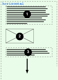
Horizontal: ltr=left-to-right reading (or rtl=right-to-left, or bidi=bidirectional),
paragraphs grow downwards.
- Latin-based systems are typically written using a left-to-right inline direction with a downward (top-to-bottom) block flow direction.
- Arabic-based systems are typically written using a right-to-left inline direction with a downward (top-to-bottom) block flow direction.
- Bidirectional: text in a single (visually displayed) block may appear with mixed directionality
ltr/rtl.
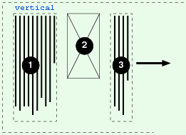
Vertical: in other language systems the reading direction is top/bottom (or bottom/top) and the block flow direction is to the left or to the right: 90 or 270 degrees rotated.
- Mongolian-based systems are typically written using a top-to-bottom inline direction with a rightward (left-to-right) block flow direction.
Sources: w3.org/TR/2012/WD-css3-writing-modes-20121115 and dev.w3.org/csswg/css-box/#writing-mode.
the differences in css2.1 and css3:
In css2.1 the vertical percentages are undefined if the containing box has no width property. In css3 is added that then the vertical percentages are based on the computed width of the content of the box.
In css2.1 always the width is the leading dimension for the computing of vertical percentages. In css3 is added that it must be the height in case of 'vertical languages'.
4. What I understand of it
The w3c has as axioma:
 "The principle of equal distances"
If only one value is given for the margin property of a box (in a percentage or in a unit),
then the absolute (computed) values of the 4 margins have to be the same.
The same principle is working for the paddings, as test 10 is illustrating.
- The consequence is: there has be chosen what is the basis for the percentage, the width or the height of the containing box.
In the 'horizontal languages' we are used to think in columns of text, reading from left to right (or rtl, or mixed); but always top/down. In order to get readable lines, the text (or: text-columns) must not exceed a certain line length. See for instance: Readability: the Optimal Line Length.
- In this way it is logical to use the width as the most important for margins and paddings.
In the 'vertical languages' the reading direction is 90 or 270 degrees rotated.
- Then it is logical to use the height as the most important for margins and paddings.
Note: All this apart from the usual problems when trying to get relative heights!

Francky Kleyneman
Nov. 30, 2013