Even when part of a sprite / zoomable with browser zoom / and if desired, animatable and/or responsive too!
(hover over the link, and see what happens)
(zoom in/out, and see what happens)
(shrink window or change orientation, and see what happens)
In the first line the "list item icon" is not responsive, the font-size is responsive, the link-icon is responsive, and the smiley is animated but not responsive.
In the second line the "list item icon" is not responsive, the font-size is responsive, the link-icon is responsive, and the smiley too (but not animated).
All images are scaled in their own way.
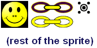
This is the one and only (transparent) sprite with the used images, in real size:
This is the HTML:
<div id="showbox">
  <p class="myListItem">Here is
    <a class="mylink" href="#somewhere">
      my link</a>
    <span class="mySmiley"></span>
  </p>
  <p class="myListItem">Here is
    <a class="mylink" href="#somewhere">
      my link</a>
    <span class="mySmileyResp"></span>
  </p>
</div>
And this is the essential CSS:
* {
  box-sizing: border-box
}
body {width: 100%; max-width: 1100px;
  font-size: 21px;
}
@media screen and (max-width: 1100px){
  body {font-size: calc(8px + 1.2vw)}
}
#showbox {
  padding: 20px 3em;
  border: 1px dotted red;
}
.myListItem {
  padding: 0 0 0 20px;
  position: relative;
}
.myListItem:before {
  /* not responsive; scaled sprite part */
  position: absolute;
  top: 50%;
  margin-top: -16px;
  left: -10px;
  width: 30px;
  height: 30px;
  content: "";
  background: url(images/test-sprite.png);
  background-position: -160px -3px;
  transform: scale(.5);
}
.mylink {
  padding: 1px 2.7em 2px .25em;
  position: relative
}
.mylink:after {
  /* responsive; scaled sprite part */
  position: absolute;
  top: .3em;
  right: .2em;
  width: 2.2em;
  height: .7em;
  content: "";
  background: url(images/test-sprite.png);
  background-position: -1.6em 0;
  background-size: 5em 2.5em;
}
.mylink:hover:after,
.mylink:focus:after {
  /* painless shift */
  background-position: -1.6em -.76em;
}
.mySmiley {
  margin-left: 10px;
  width: 54px;
  height: 54px;
  display: inline-block;
  vertical-align: middle;
  position: relative;
}
.mySmiley:after {
  /* not responsive; scaled sprite part */
  position: absolute;
  top: -4px;
  width: 54px;
  height: 54px;
  content: "";
  border: 1px solid green;
  border-radius: 50%;
  background: url(images/test-sprite.png);
  background-position: -3px -3px;
  animation: 6s dizzy ease-in-out alternate infinite;
}
@keyframes dizzy {
  0% {transform: scale(.75) rotate(-15deg);}
  25% {transform: scale(.3) rotate(1980deg);}
  35% {transform: scale(.4) rotate(1980deg);}
  40% {transform: scale(.4) rotate(1980deg);}
  50% {transform: scale(.55) rotate(1980deg);}
  70% {transform: scale(.75) rotate(-15deg);}
  100% {transform: scale(.75) rotate(-15deg);}
}
.mySmileyResp {
  margin-left: 10px;
  width: 3.8em;
  height: 3.8em;
  display: inline-block;
  vertical-align: middle;
  position: relative;
}
.mySmileyResp:after {
  /* responsive; scaled sprite part */
  position: absolute;
  top: -4px;
  width: 3.8em;
  height: 3.8em;
  content: "";
  border: 1px solid green;
  border-radius: 50%;
  box-shadow: .1em .1em .5em rgba(0,0,0,.5);
  background: url(images/test-sprite.png);
  background-position: -.2em -.2em;
  background-size: 14em 7em;
  transform: scale(.85) rotate(15deg);
}
Tested in Firefox, Chrome, Opera and Internet Explorer 11 on desktop under Windows-7; and succeeded.
(Note: Without special attention for accessibility.)