Scrollbar: none ?
... a simulation of a spectre on desktop ...
(not responsive, to view on desktop only)
Background
Triggering for this improvisation was the scrollbar-width property in the Editors Draft of the CSS Scrollbars Module Level 1
(ED 14 November 2018, work in progress), and the
Github-opinions about it.
Box 1
Website updated!
We are proud to announce that our website has had an amazing makeover! Not only in the clean design, but our site is now completely 'responsible'.
Do you have something to say about the new website? Please use the comment form to send us your comment.
About the design
In the new design are easy use and fast performance the main principles. Just as simple as possible!
About responsible
That means that the site and the apps can be used on whatever cell phone or touch screen you might have.
Comment form
Etc.
Lorem ipsum dolor sit amet, consectetuer adipiscing elit, sed diem nonummy nibh
euismod tincidunt ut lacreet dolore magna aliguam erat volutpat.
Thanks for your reaction!
Box 2
About us
Our mission is to be a dynamic team, devoted to give you the best service we can imagine.
About you
We are convinced that you are a unique personality, with your unique desires. We collect your personal data, so we can
offer you just what is in your sphere of interest. And we care about your privacy! See our privacy statement.
About digital safety
We have made the maximum of security measures for the site and our internal computers. More about this in our Terms and Conditions.
Privacy statement
At vero eos et accusamus et iusto odio dignissimos ducimus qui blanditiis praesentium
voluptatum deleniti atque corrupti quos dolores et quas molestias excepturi sint occaecati
cupiditate non provident, similique sunt in culpa qui officia deserunt mollitia animi,
id est laborum et dolorum fuga.
Harum quidem rerum facilis est et expedita distinctio. Nam libero tempore, cum soluta
nobis est eligendi optio cumque nihil impedit quo minus id quod maxime placeat facere possimus,
omnis voluptas assumenda est, omnis dolor repellendus.
Temporibus autem quibusdam et aut officiis debitis aut rerum necessitatibus saepe eveniet ut
et voluptates repudiandae sint et molestiae non recusandae. Itaque earum rerum hic tenetur a
sapiente delectus, ut aut reiciendis voluptatibus maiores alias consequatur aut perferendis
doloribus asperiores repellat.
Praesent placerat bibendum dui at aliquet. Morbi sapien justo, consequat et elementum et,
molestie a odio.
Nulla hendrerit libero quis leo porta sodales. Proin mattis turpis ut quam porttitor fringilla.
Donec placerat, arcu et venenatis ultrices, sem purus feugiat nisl, et mollis mi sapien id
lacus. Ut metus massa, fermentum a dapibus a, ornare id urna. Vivamus augue mauris, pretium vel
lacinia a, euismod a arcu. Nullam egestas porta adipiscing. Nunc eget placerat massa. Sed et
turpis tellus.
Vestibulum ante ipsum primis in faucibus orci luctus et ultrices posuere cubilia
curae; phasellus sed nulla augue. Suspendisse in felis dolor. Etiam tristique scelerisque bibendum.
Terms and Conditions
At vero eos et accusamus et iusto odio dignissimos ducimus qui blanditiis praesentium
voluptatum deleniti atque corrupti quos dolores et quas molestias excepturi sint occaecati
cupiditate non provident, similique sunt in culpa qui officia deserunt mollitia animi,
id est laborum et dolorum fuga.
Harum quidem rerum facilis est et expedita distinctio. Nam libero tempore, cum soluta
nobis est eligendi optio cumque nihil impedit quo minus id quod maxime placeat facere possimus,
omnis voluptas assumenda est, omnis dolor repellendus.
Temporibus autem quibusdam et aut officiis debitis aut rerum necessitatibus saepe eveniet ut
et voluptates repudiandae sint et molestiae non recusandae. Itaque earum rerum hic tenetur a
sapiente delectus, ut aut reiciendis voluptatibus maiores alias consequatur aut perferendis
doloribus asperiores repellat.
Praesent placerat bibendum dui at aliquet. Morbi sapien justo, consequat et elementum et,
molestie a odio.
Nulla hendrerit libero quis leo porta sodales. Proin mattis turpis ut quam porttitor fringilla.
Donec placerat, arcu et venenatis ultrices, sem purus feugiat nisl, et mollis mi sapien id
lacus. Ut metus massa, fermentum a dapibus a, ornare id urna. Vivamus augue mauris, pretium vel
lacinia a, euismod a arcu. Nullam egestas porta adipiscing. Nunc eget placerat massa. Sed et
turpis tellus.
Vestibulum ante ipsum primis in faucibus orci luctus et ultrices posuere cubilia
curae; phasellus sed nulla augue. Suspendisse in felis dolor. Etiam tristique scelerisque bibendum.
You agree that we can change the Privacy Statement and Terms and Conditions at any moment,
without announcement.
Come back every now & then and read carefully to see if something
is changed.
Box 3
Our webshop
Vestibulum ante ipsum primis in faucibus orci luctus et ultrices posuere cubilia
curae; phasellus sed nulla augue. Suspendisse in felis dolor. Etiam tristique scelerisque bibendum.
Our service
Harum quidem rerum facilis est et expedita distinctio. Nam libero tempore, cum soluta
nobis est eligendi optio cumque nihil impedit quo minus id quod maxime placeat facere possimus!
New pages
Similique sunt in culpa qui officia deserunt mollitia animi, id est laborum et dolorum fuga.
More content
Lorem ipsum dolor sit amet, consectetuer adipiscing elit, sed diem nonummy nibh
euismod tincidunt ut lacreet dolore magna aliguam erat volutpat. Ut wisis enim
ad minim veniam, quis nostrud exerci tution ullamcorper suscipit lobortis nisl
ut aliquip ex ea commodo consequat.
Duis te feugifacilisi. Duis autem dolor in hendrerit in vulputate velit esse
molestie consequat, vel illum dolore eu feugiat nulla facilisis at vero eros
et accumsan et iusto odio dignissim qui blandit praesent luptatum zzril delenit
au gue duis dolore te feugat nulla facilisi.
And more ...
At vero eos et accusamus et iusto odio dignissimos ducimus qui blanditiis praesentium
voluptatum deleniti atque corrupti quos dolores et quas molestias excepturi sint occaecati
cupiditate non provident, similique sunt in culpa qui officia deserunt mollitia animi,
id est laborum et dolorum fuga.
Still more!
Et harum quidem rerum facilis est et expedita distinctio. Nam libero tempore, cum soluta
nobis est eligendi optio cumque nihil impedit quo minus id quod maxime placeat facere possimus,
omnis voluptas assumenda est, omnis dolor repellendus.
Action period: this week only !
Special offer:
LOREM
Only $ 5,00 !
Temporibus autem quibusdam et aut officiis debitis aut rerum necessitatibus saepe eveniet ut.
Gratias moltos por readinga
lottof latina paragraphica. 
Box 1
This is the "worst case scenario". Imagine this. The company of the site has bought a template of a skilled designer. In the template, accompanied
by a manual, are all the tools to get the site easily usable for mobile and desktop devices.
Company happy: the old website didn't pay too much attention to mobile (a growing amount of their customers).
The young PR assistant is the webmaster of the company, and is mostly concerned about the content of the site ("the rest is done by
the CMS"). In his/her enthusiasm (s)he had overlooked the paragraph in the manual in which was explained that with a hidden scrollbar
(animated by touch) something extra has to be done for desktops.
Focused on cell phones, (s)he asked his/her friends: "Does it work on your GSM?". Now the friends are of the generation that never
touches a desktop, so the answers were: "Yes! Fully responsive! Funny scrollbars! It is working like gangbusters!"
In the meantime a desktop visitor of the site doesn't see that there is more in Box 1. - A mouse exploration doesn't do anything (unless (s)he
touches by accident the scroll wheel on the mouse when the mouse pointer is in the box).
Box 2
In this scenario the scrollbar is animating for a moment, if the desktop visitor has the luck to mouse slowly over the right border of Box 2.
Then (s)he can go back. But if found, the scrollbar is "thin" and difficult to grab with the mouse pointer.
Box 3
This scenario has a "custom scrollbar", facilitated by a scrollbar-width:none rule. - An animation points to the Down and Up buttons.
In this clean minimal design the Down and Up buttons are the only remnants of the old scrollbar. These small buttons are friendly for
touch devices, but again hard to use for desktop visitors; and too many scrollbar variations can be confusing.
Partial solutions?
Maybe a mandatory indication that the element is scrollable, which will conjure up the scrollbar; more or less like this:
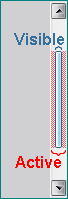
What could help for 'thin' scrollbars on devices with a pointer (desktops/laptops), is to extend the Visible thin scrollbar with
an invisible (transparent) but Active surface left and right. Then the grabbing area for the pointer can be as width as the default
scrollbar, and is easy to catch.
Other conditions?
Realizing that improper use by "an unknown part of CSS-users worldwide" is inevitable, I think it would be great if there could
be certain mandatory conditions: applications other than the platform scrollbar(s) are only permitted/working if the conditions
are fulfilled. Maybe some rules could be made platform/feature-dependent in some way, in the spirit of:
- (default)
- scrollbar-width: "auto" (default platform-size)
- scrollbar-width: "thin" (thin platform-size, with defined min-width of ..px) (desktop usability)
- scrollbar-width: <length> only for custom scrollbar; min-width = thin platform-size; max-width = default platform-size
- scrollbar-width: ("none" = not allowed, neutralized by error handling)
- @media (hover: none) {
- scrollbar-width: "auto" (default platform-size)
- scrollbar-width: "thin" (thin platform-size, with defined min-width of ..px) (can be smaller than the default thin)
- scrollbar-width: <length> only for custom scrollbar; no min-width; max-width = default platform-size
- scrollbar-width: "none"
}